WGSN Feature!

Great news, everybody!

My animal print was features in WGSN 2017/2018 Kids trends board!

You can view it here

This is absolutely amazing! I love iridecence in all its materials, and to be features in the iridecent board, is the biggest pleasure:)

Thank you, WGSN!


Oh, and here's the print!

animal

Once a week we send you updates, news and special offers. Subcribe and get a gift ! 

Khloe Kardashian is wearing my print!

Yesterday I was extremely surprised to find out, that Khloe Kardashian is wearing my print on her sportsbra!

I designed this pattern about a year and a half ago, here's my creative process. 

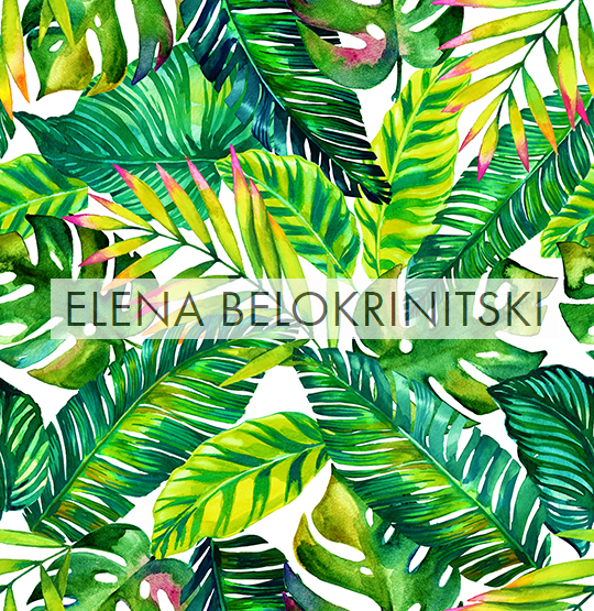
I drew the leaves in watercolor ( I usually use Van Gogh and St Petersburg watercolors)

Here are many leaves, but I only chose some for this pattern. 

From all of those elements, I have prepared this pattern:

You can download this pattern from my Shutterstock account! Just click the image. 

You can download this pattern from my Shutterstock account! Just click the image. 

But this isn't the only design, created with these elements. I try to use the elements to create as much as possible versatile designs. But all of them look quiet different, here are few exapmles.

Thankx, Khloe, for wearing my pattern!


Vienna Butterfly Museum

Last week I have been to Vienna for my birthday. 

On the last day we went to a butterfly museum. The butterflies slowly flying all over the place, not afraid of visitors, large and gorgeous - what a treat!

First Time Heimtextil Exhibitor guide - part 2. Home and Travelling Equipment for Heimtextil

Home kit for preparing the prints:

  • cutting board ( I had A2 size),
  • wide and narrow transparent  sellotape
  • knifes
  • safe ruler (with an angle to protect your fingers, you will be cutting the edges for hours - better be safe than sorry)
  • a file to keep the prints (I used A2 file, and folded my A1 prints in two)


Travelling kit for the show (You receive a booth with empty walls, and you must be prepared to hang your presentation):

  • an artist bag or a trolley for your designs. I uses a “start by Prat” backpack, which isn’t perfect but has a huge winning point over other bags, because it’s a backpack, with strong and adjustable shoulder straps. Carrying 20kg of designs on a side with a mailman bag would be impossible, and this bag divides the weight evenly on your back.  I see that there’s some decent competition online for these kinds of bags, some of them with better reviews, and the reason I got mine from Prat was it being the only bag I could touch and try on in a shop, and I didn’t want to risk buying online something that doesn’t look strong enough.
    Some people use trolley bags, and fold and roll the prints inside. It's a simpler solution, but  I wouldn't rick damaging the corners of the artwork. 
  • rolls of bubble wrapping for the designs
  • a few A2 files for the designs.
  • 2 rolls of M3 double sided adhesive tape (to stick the designs to the walls)
  • a set of large paper clips (I had 10, but needed 20). 
  • a set of magnets (better secure  and align the prints on the frame before gluing with the tape).
  • 2 knifes.
  • scissors - 2 pairs.


Kit for the show:

  • a pack of visit cards
  • a pack of receipts with copy paper
  • few ball pens.
  • wrapping solution for your prints, when you sell.
  • rubber bands
  • water and disposable cups - for yourself and your customers.

Please let me know if you would like me to note prices for everything that I have bought. 


First Time Heimtextil Exhibitor guide - part 1.Printing your designs large format for the Fair.

You are probably a textile designer, who has a few years of experience with textiles and designs in the interior market. You have seen your designs on products before, and have an idea about the difference between designing for fashion and for interior.

You have probably already visited a show or few of them.  And now you want to exhibit. Where to begin? How to prepare?

This guide is a summary of my personal experience as a first time Heimtextil Exhibitor.

I have shared my booth with a friend, who was participating for her second time. Doing things together is so much better than alone, especially for the first time!

Here is my own list of maximizing your printing. You may do things differently, but I hope it will at least give you a reference about where to begin.

Our stand on Heimtextil.  Left side is Natasha Levental's beautiful designs, right - me, Elena Belokrinitski

Printing the designs:

From my personal experience, files of 200 dpi and up, look good printed for textile. If you don’t have a professional printer at home, I’d suggest to research the market for the right printshop for you. Try same test image and print it on different printers and papers.

           Things to check:

  • The whitest paper color (some are yellowish)

  • The blackest black

  • Intense colors when you want them bright.

  • How easily the color brushes off (some blacks almost cannot be touched - the will be brushed away and left with finger prints immediately. You are not framing your designs, but will touch and move and roll them - choose not too gentle print quality).

  • weight of paper 140 gr/m and up will do, depending on the quality of the paper.

Printing on roll paper is always cheaper than on single sheets.

I’d say that most of the designs, presented at Heimtextil are 23” x 31” and up. There are many different paper rolls which may suit you for this size, consult your printshop.

  • I’d suggest printing few of your best designs immediately, carefully inspecting the results results at home, and only then proceeding for the whole batch.

  • Printing is slow. For a large number of designs it may take a few days, maybe even a week. Plus, if you chose a special paper, the print shop might need to order it for you. Give at least 2 weeks for that.

  • Also, print a color palette. Pick colors with an eyedropper in Photoshop, and create your own color test palette. It’s essential for:

  1. Having spacious designs with lot’s of same color backgrounds - make sure your plain color is what you intended it to be.

  2. Having to deal with shades of off-white/ eggshell / milk / beige / grayish / champagne /  ivory - check before your print! Subtle tonalities may be translated poorly into paper unless you calibrate.

  3. Also colors like mustard/  taupe/ brown/ grey / camo/ khaki may be confusing.

Just an example of a design, which palette should definitely be tested prior printing - if the gentle colors come out dirty or messy, it's a pity. 

You may decrease the size of your prints to lower costs and to ease transportation. However, keep in mind that a full repeat must be shown in your format, and if not, at least add a mock up with a full repeat.

large format printing: seeing your repeat as appose to printing smaller format, and attaching a mock-up of the repeat - it can be very beneficial.

That's it for now for printing your collection. I did not touch the issue of creating your collection, because I assume that if you are interested in exhibiting, you have it good and ready. But if there will be a need for such post, I will write some of my own thoughts about it. 

The next post will be about the equipment that you need at home, stay tuned.

Gypsy collection

I am in strong intense colors, bohemian decor, and killer flowers. 

These are some highlights from the latest collection. 

Contact me if you would like to see more. 


Heimtextil preparations.

I have been thinking of exhibiting at the Heimtextil fair for  a long time now, but thought of it as a too complex project. 

This year, I have paired up with a wonderful designer, Natasha Levintal, and together we will offer to take a look on our 2017 collection of home textiles for wallpaper, soft furnishings, bedding, and other. 

I am bringing a few themes to the table: of course, paisleys, florals, ethnicals, very experimental abstracts, many kaleidoscopes, and a few classic wallpaper ornaments. Here's a glimpse on one of one of my themes: 

heimtextil trend idea

And there are plenty of more to come. 

So hope to see you all in Frankfurt! Wish me LUCK!

I have created an inspiration board for interior textiles on Pinterest.  

Paisleys are forever?

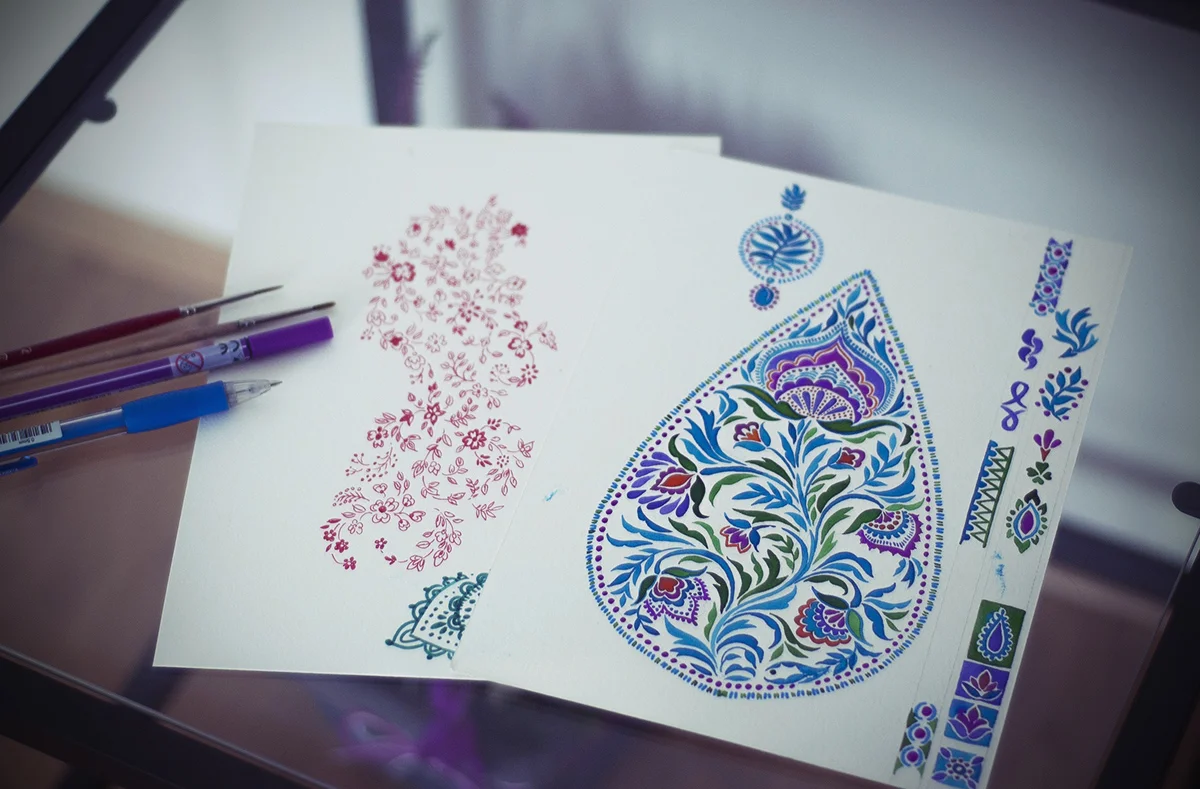
These past few days I have been busy drawing paisleys. 

Eventually, everything comes back to paisleys, doesn't it?

I love how it has a bit of air inside. Should try more of these. 

I love how it has a bit of air inside. Should try more of these. 


 But every time I go back to paisleys, I try to find something new, something fresh, something interesting. My previous post about paisleys was a much more intuitive one, detailed, but rather artistic. This time It was all about the details. 

Some of the process: 

this one became an amazing pattern. 

this one became an amazing pattern. 

not finished yet...

not finished yet...

all those details!

all those details!


I think I have created two dozens of paisley sheets, but those are just a few for the taste. I used watercolors and ink, and mostly - patience.  

If you are interested to see my inspirations for these illustrations, come and see my favorite paisley styles on my Pinterest Board .


Favorite inspirations - abstract

There are a few designers, whom I find amazingly interesting, inspirational, and absolutely love what they do. What I like best, I think, is the diversity within very consistent style. 

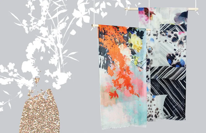
The first one is Dikla Levsky, whom I discovered vert recently, and I am blown away by her work in silk scarfs. The are so light, and amazingly colorful, and beautifully neurotic, and I am in love. I think she studied two years after me in Shenkar, but unfortunately I never got to meet her at that time. 

Click through some of my favorite of her textiles:

Check her Etsy Shop - DiklaLevskyDesign


The next one is Georgiana Paraschiv, who is absolutely extraordinary.  Her style is grungy, yet tender, and the colors are amazing. It sometimes seems, as if her work is very intuitive, but from the experience I have - making an abstract brush stroke, which looks effortless and poetic, can be at times much much more difficult, than creating a complex illustration.  

Check out few of her pieces for inspiration. 

The next genius designer, is Helen Dealtry, who is an ispiration in anything she does- abstract, watercolor, figurative. Her style is recognizable,  but so versatile, I leaves me speechless. I guess, for me, her most signature feature, is the feeling of air in her works. Even when intense, they are never choked, and the black spaces, as in literature, only give you a place for though. I'm blown away by her talent. I wish I could take her drawing course. 

Check a few of my favorites below, and go visit her amazing website here- Helen Dealtry

Ok, so that were my top 3 artist for abstract textiles, patterns, and the beauty of the mystery. 

Hope you enjoyed! 


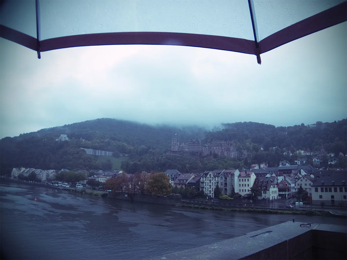
Heidelberg

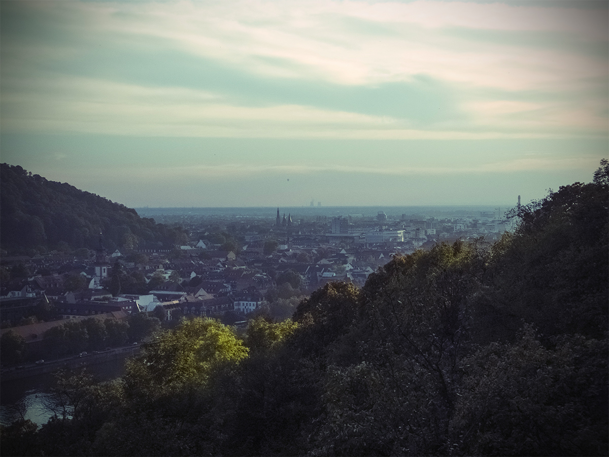
For our first wedding anniversary, we chose a place, which had a magic castle.  Heidelberg, Germany.

The old city was stunning. 

The first day was sunny, the second was rainy and fogy, which was even more magical.  

What I loved the most, was the forest.  The smell of a wet autumn forest is something that I have missed  without even realizing it.  Spending a day in a forest, looking for insects, berries, mushrooms was a dream vacation for me. We should do it more often, really. 

There's plenty of forest picture! be certain to scroll! :)

So I couldn't resist...

but hung the latest paisleys (not all, forgot some, damn!) and created this little loop.

paisley loop

Bedroom wall, always good to have a blank wall. 

room2.jpg

Coachella Textiles

Last week I visited Premiere Vision in Paris, which was not only inspiring, but also nerve-racking: 

So many brilliant textiles, so many talented artists. Makes me want to sit in my studio and draw for 20 years in a row. 

So as I returned home, I immediately set down to draw new stuff, new designs. This time the theme is Coachella inspired bohemian textiles. 

the pictures are mostly taken from popsugar.com

... So I began drawing, starting with paisleys, imaginary flowers, and swirls. 

and here are some of the patterns and prints. 


I plan to do much more of those prints, mainly focusing on placements and patchwork.

Some of them are already available for download HERE, actually there are plenty of other bohemian patterns, check them out. 

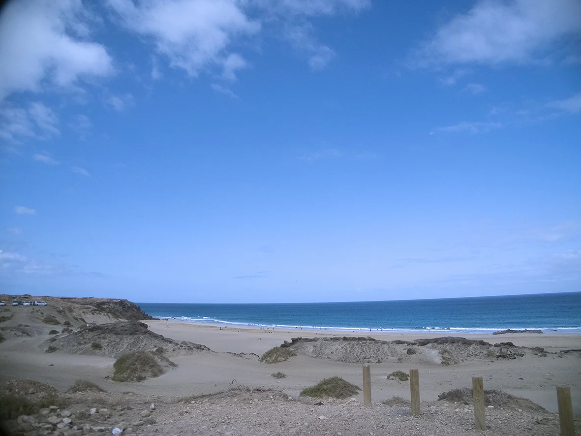
Canary Islands Vacation.

I am just back from Fuerteventura, from a dream-come-true vacation. We though, where do we wanna go? And answered ourselves: to any place, which has a sea, like in ads: transparent blue water, endless beaches, perfect weather.  So we visited the Canary Islands. 

Perfection.

Perfection.

This vacation gives a lot of inspiration: colors, clean abstracts, gradients. 

There's a beautiful project by This Is Kae, that has this sort of move and vibe, which is also extremely inspiring - torn papers create a spontaneous landscape. I would love to try this technique. 


Cut out lace

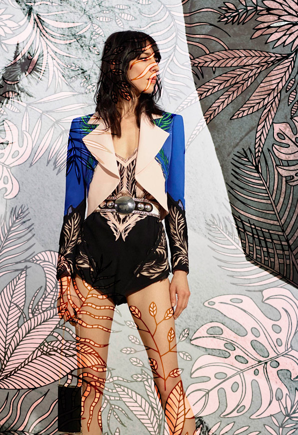
I really like this theme, its gentle, yet bold, feminine, but the symmetry makes it stronger. 

The image is from Style.com, Roberto Cavalli Resort 2016, my illustration above.

The image is from Style.com, Roberto Cavalli Resort 2016, my illustration above.

Flower Lace: 1, 5 Ask me to buy these prints.2 Can be purchased in different color combo here3 Can be purchased in different color combo here4 Can be purchased in different color combo here

Flower Lace: 

1, 5 Ask me to buy these prints.

2 Can be purchased in different color combo here

3 Can be purchased in different color combo here

4 Can be purchased in different color combo here